Task usage on dashboard is confusing
Status: Closed · Asked by solipsist on · 0 views
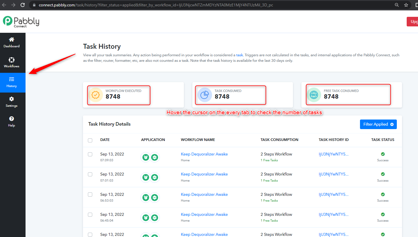
I can see that some workflows use over 8,000 tasks, but it's impossible to see which ones. The highest using workflow uses only free tasks, or that's how I read it.
Either way, this page needs some serious UX work. Right now it makes no sense.
Hey @solipsist
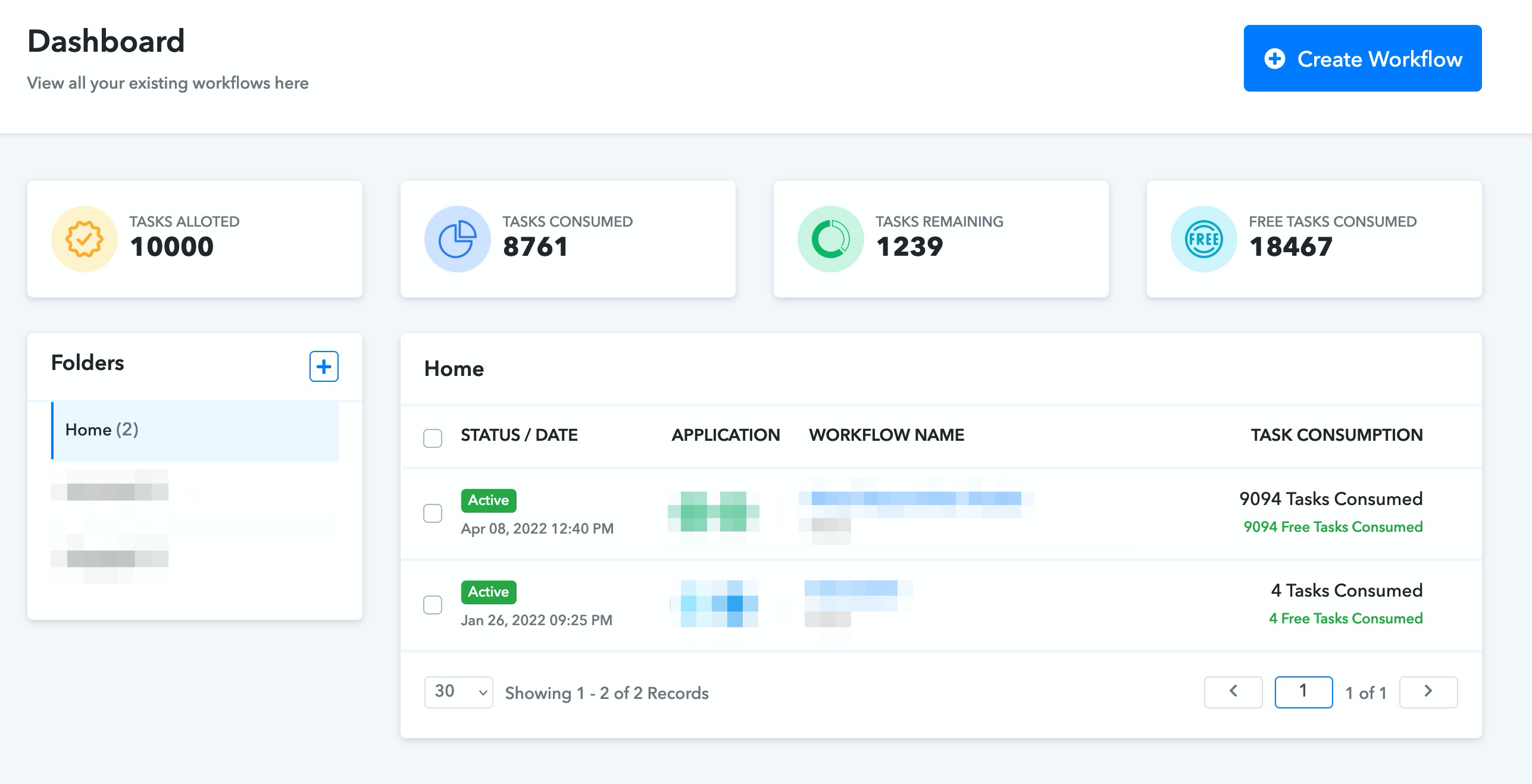
With the first workflow'task consumption, your workflow only used the free tasks till now and the overall task for that workflow is also the same since no other application with its task has been used.
That wasn't all clear...
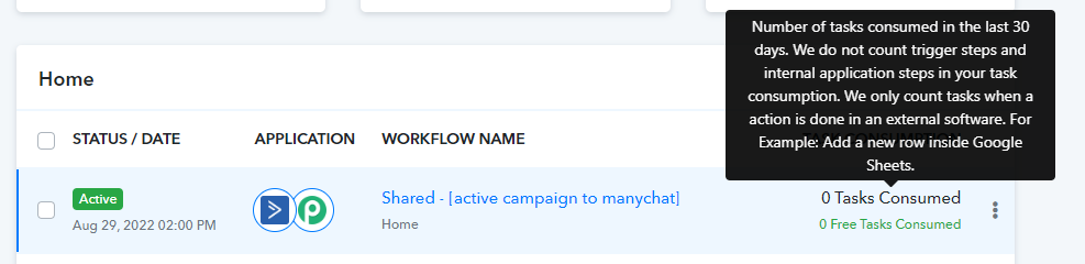
How can I find out what workflows are using all these paid tasks? The paid tasks in the task usage column in the list of workflows doesn't add up to more than a few hundred.
Hey @solipsist
You can trace the same in the overall history section of your Pabbly account.
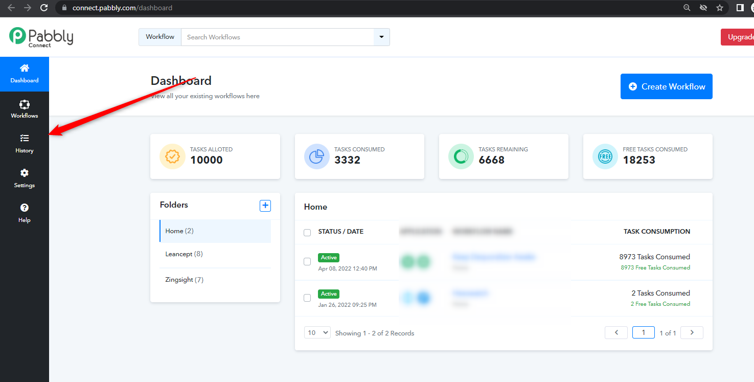
That doesn't provide the information I need. I figured out what workflow used all those tasks, despite the confusing dashboard. The problem is this: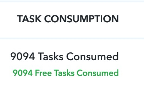
It looks like the black text shows the total usage (paid + free). But it shows paid, and the free is shown below in green. The total task usage (free and paid) is the sum of the two and not shown here. This is very poor UI design. Especially with the paid being designed as a header in black. It gets extra confusing when a workflow uses one free and one paid task. Using the word "task" for a paid task adds to it. You need to qualify each type of task!
This is how it should be shown:
9,094 paid tasks consumed
9,094 free tasks consumed
Hey @solipsist
That doesn't provide the information I need. I figured out what workflow used all those tasks, despite the confusing dashboard. The problem is this:
[IMG alt="1662986392294.png"]https://forum.pabbly.com/attachments/1662986392294-png.15484/[/IMG]It looks like the black text shows the total usage (paid + free). But it shows paid, and the free is shown below in green. The total task usage (free and paid) is the sum of the two and not shown here. This is very poor UI design. Especially with the paid being designed as a header in black. It gets extra confusing when a workflow uses one free and one paid task. Using the word "task" for a paid task adds to it. You need to qualify each type of task!
This is how it should be shown:
You can check the task count of the specific workflow into its history section of the workflow.